Ember App Icon

Ember

Made with ❤️ in Italy for California

Ember is an iOS app that leverages generative AI to help Californians create personalized wildfire evacuation plans for their homes in a fast and private way.

COMING SOON!

The Spark

The idea for Ember was born in California during Apple's WWDC 2025. I had the privilege to spend time there, and it left a deep impression on me. California is stunning, full of energy and creativity, but at the same time it suffers every year from devastating wildfires. Seeing the contrast between its beauty and its vulnerability really struck me.

When I came back home, I carried two things with me: a renewed love for California and its people, and powerful new tools announced at WWDC, particularly Apple's on-device large language models.

Ember was the result of putting those two together. It became a way to use cutting-edge technology in a meaningful way, creating something that could genuinely help people in moments of uncertainty and fear.

My Vision

For Ember I didn't want just to write code or to make things look nice, but to imagine what the app should feel like in the hands of someone who might one day rely on it.

The vision was clear: Ember had to be minimal, simple, and beautiful. But beauty here wasn't about showing off. It was about clarity, humanity, and reassurance. The app needed to feel respectful of the user, their privacy, and the stressful context in which it would be used. In other words, Ember had to earn the user's trust from the very first interaction.

Designing the Experience

When designing Ember, I approached it with the same attention to detail that inspires me in Apple's own work. Every element mattered:

  • The choice of colors that would feel calming rather than alarming.
  • Animations that were subtle, not flashy, so the user felt guided instead of distracted.
  • A flow that made the experience as light as possible, because in an emergency, no one has energy for complexity.
Designing Ember

The process was designed to be incredibly straightforward: answer a few focused questions, and Ember produces a complete evacuation plan tailored to your home and needs. The challenge was to make that simplicity invisible, so users just felt supported, not burdened.

Building the Core

On the engineering side, Ember was an opportunity to fully embrace Apple's latest technologies. At its heart, it runs on Apple Intelligence's lightweight, on-device language models, which meant two crucial things: speed and privacy. Plans are generated almost instantly, and the user's personal information never leaves their device.

I also experimented with the new Liquid Glass design language, which gave Ember a look and feel that is premium, familiar to iOS users and yet distinctly its own. Integrating this into a product that deals with emergencies was not straightforward, but it gave the app a personality that feels warm rather than sterile.

Ember meets Liquid Glass

Challenges

Every project has hurdles, and Ember had three major ones.

The first was technical. The on-device LLM, while impressive, is still relatively small compared to cloud-based models. Getting it to produce high-quality evacuation plans required many iterations. I fine-tuned prompts, adjusted parameters, and experimented relentlessly until I reached a balance between accuracy and usefulness, with minimal risk of hallucination. Despite this commitment, the quality of the outputs is still limited by the capacity of those early models, and as the models improve through time, this quality will improve too.

The second was design. Liquid Glass is expressive, almost playful, but an evacuation app needs to communicate seriousness and urgency. Finding the right middle ground, where Ember could be both beautiful and appropriate, required me to prototype, test, and rethink my approach several times.

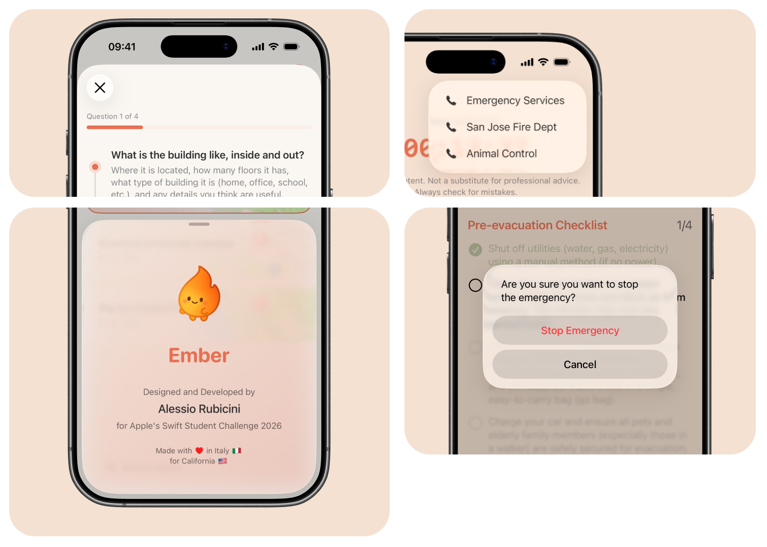
The third challenge was finding the right mascot for Ember. Since the app was essentially an assistant, I felt it needed a recognizable presence that could represent it. I spent a lot of time exploring different directions before realizing that a smiling, friendly flame was the perfect fit. It carries warmth through its soft, calming colors, while at the same time humanizing fire. Designing Ember's mascot was not just about a single image, but about creating multiple variations that could appear in different moments of the experience, such as when no evacuation plan is yet created or when one is active. This made Ember feel dynamic, supportive, and present, like a reassuring companion guiding the user through every step.

Ember Icons

The Result

The final version of Ember is, in my eyes, the best app I have built so far. It represents the balance I always aim for: advanced technology put in service of a clear human need, presented through an experience that feels thoughtful and natural.

Ember Final App Screenshots

When I look at Ember, I see not just an app, but a philosophy of design and development: that tools should be powerful without being overwhelming, private without being restrictive, and human without losing precision.

What I Learned

More than any project before, Ember sharpened my eye for detail and design. I learned how small things add up to big differences.

It also taught me about the delicate balance between innovation and responsibility. Working with generative AI in an emergency context forced me to think not just about what was possible, but what was appropriate. Ember reminded me that design and engineering are always about people first.